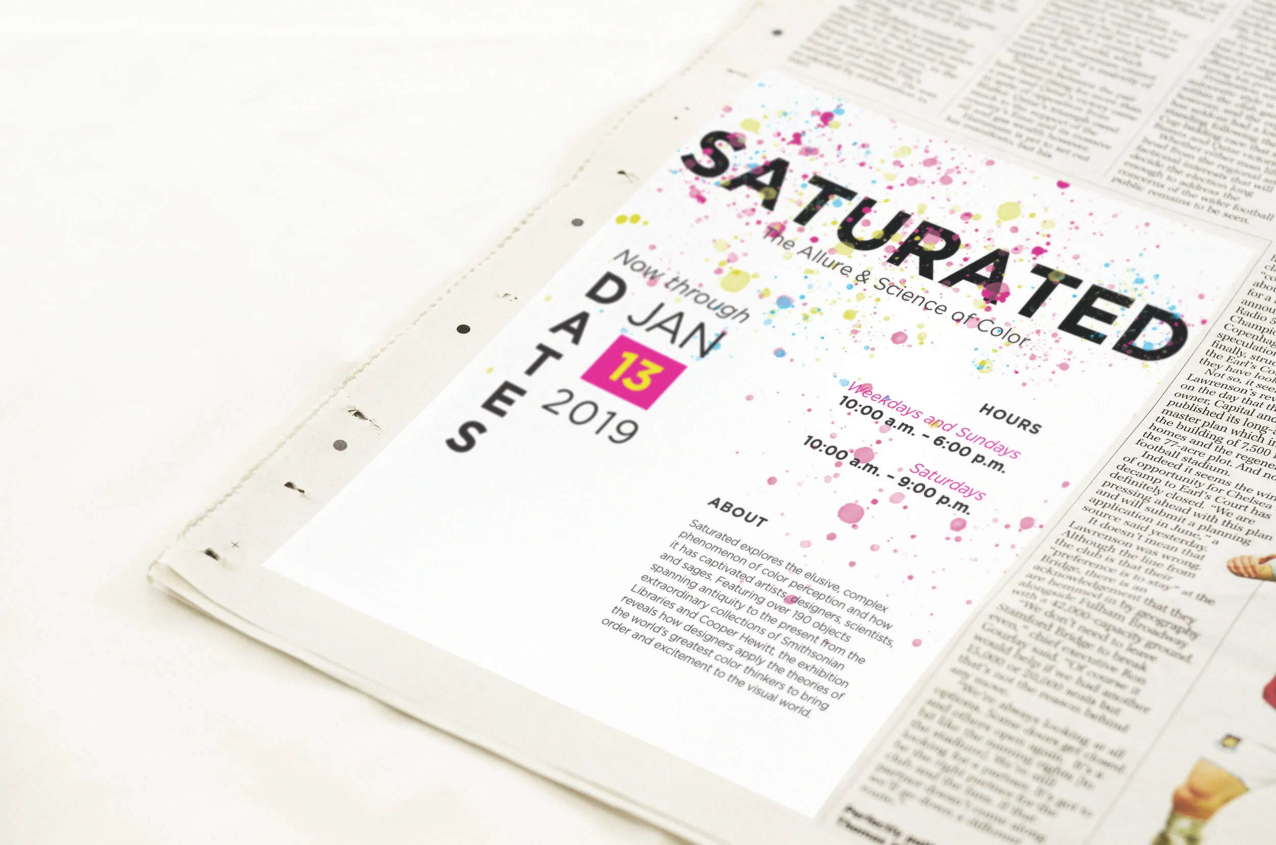
Saturated Event Branding


I was given just 48 hours to complete a poster about the Saturated exhibition for the Cooper Hewitt Museum in New York for our first project this semester. I had to quickly decide on a layout and color scheme. I ended up using the colors for CMYK, because one of our challenges was to use no more than 4 colors. I thought the splatter paint effect at the top of the page added a pop of color and was fitting for the exhibition topic. I wanted the title to be the emphasis of the poster to grab the viewer’s attention.